Colors and Fonts
Colors
The UTHSC Branding Guidelines calls for the use of the color palette below in order to bring visual consistency to print and digital marketing materials and designs across the university. To ensure a color is correctly on brand, please only use the codes listed below. Contact the Office of Communications and Marketing at communications@uthsc.edu or 901.448.5544 if you have any questions.
Primary Colors
The primary colors for the university are UTHSC Orange and UTHSC Green.


Secondary Colors
The secondary colors complement the primary colors and should not be used alone.


Accessible Use of Colors for Digital
The University of Tennessee Health and Science Center websites and digital applications aim to comply with WCAG 2.1 AA guidelines. This includes a required contrast ratio for text and images of text of at least 4.5:1 for normal text and 3:1 for large text. WCAG 2.1 requires a contrast ratio of at least 3:1 for graphics and user interface components (such as form input borders).
Fonts
Primary Font
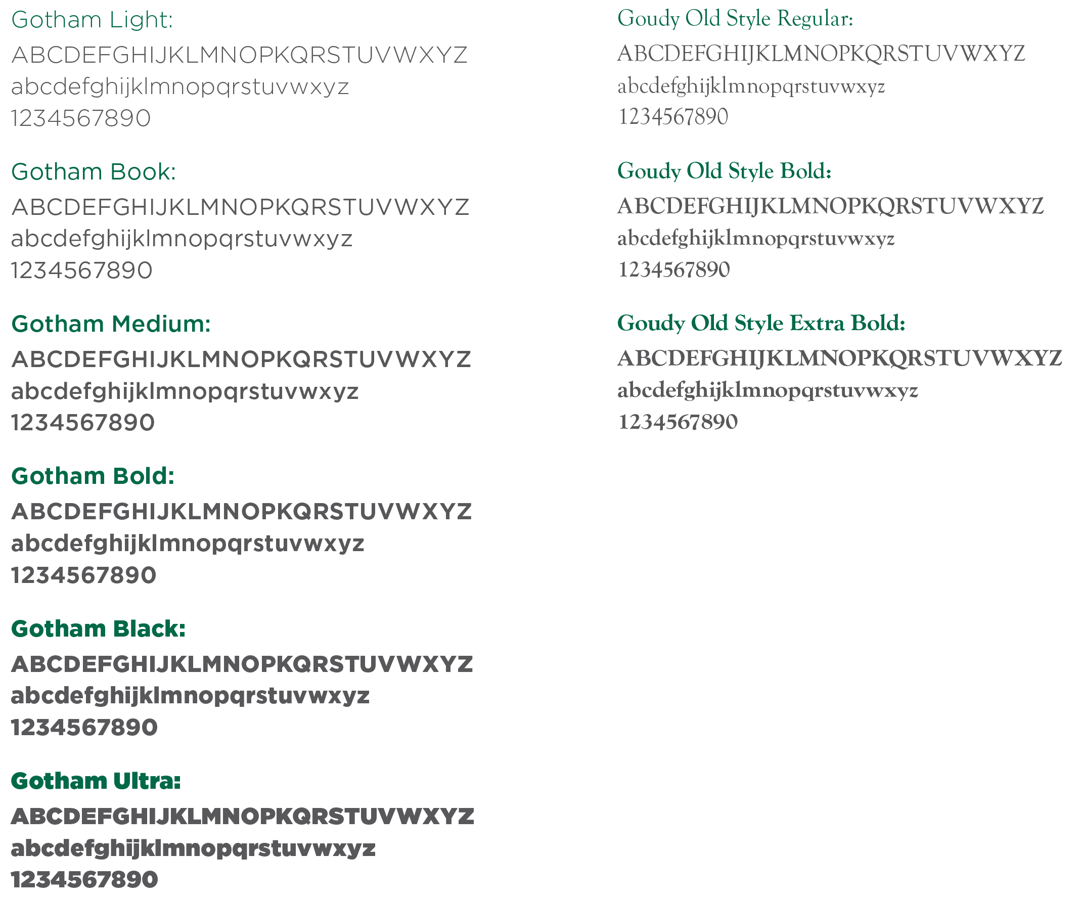
Gotham is the primary font for UTHSC. This modern sans-serif font family is very accommodating for the UTHSC style and is the preferred font for marketing materials, promotional products, and signage across the university. Users must have a license to use the official brand fonts.
Website Font
Open-source alternatives, such as Montserrat, are encouraged to be used by non-designers for presentations, letters, and other materials utilizing the UTHSC brand. Montserrat font can be downloaded for free through Google fonts. Montserrat is used as the primary typeface for university websites.
Secondary Fonts
Goudy is a secondary font for UTHSC and used when a serif font is required. This font is used in the UTHSC wordmark.
When designing for digital media, such as email or Microsoft Office applications (i.e. Word, PowerPoint, etc.), Arial is the acceptable font.

